
LOYALTY REFERSH
Duration
March 2017 - June 2017
Role
Research, UX/UI Design
Client
Bloomingdale's
Project Overview
Loyalty program was launched as a customer reward system in Bloomingdale’s. Once join the program, customers will earn loyallist points - which can be transferred to reward dollars - as they shop. The more they spend, the more they get. At the same time, customers will enjoy certain privileges for being a loyalist of Bloomingdale’s.
Apart from seeing the potential of gaining customers and growing sales, the loyalty team (business owner of this project) got a few consumer complaints as well. Thus, the team planned to update the online loyalty pages to promote the program and tackle the feedback at same time. I, as the sole UX and UI designer, had to go deep into the consumer needs to see where the blockers were, and also kept the major KPIs - like sign up rates - in mind for the business stakeholders.
Initial Problem
Interpretations From Customer Feedback
There’s no easy-to-understand explanation about loyalty points and reward cards for customers to look for.
The customers are not well-informed of the perks that comes with the enrollment in the loyalty program.
Research & Explorations
Understanding The Pain-points Of Different Users
As I started to collect different user scenarios, I realized that, at Bloomingdale’s, there are different ways to become a loyallist. You could register at store, you could sign up online, or you will be enrolled automatically if you got a Bloomingdale’s credit card. Therefore, we could possibly have 9 different types of users regarding the loyalty program as follow.

scenarios
With that in mind, I did an observation session by inviting people to experience different user journey with different accounts info given in the testing environment. They had to figure out how to get loyalty information they need starting from the homepage under different tasks they are assigned to. During the process, I noted down the pages some users spent most time on or having trouble going forward. I also had a small conversation with each tester to see what they thought about the experience, and if they successfully got to the page and understood what they were looking at.
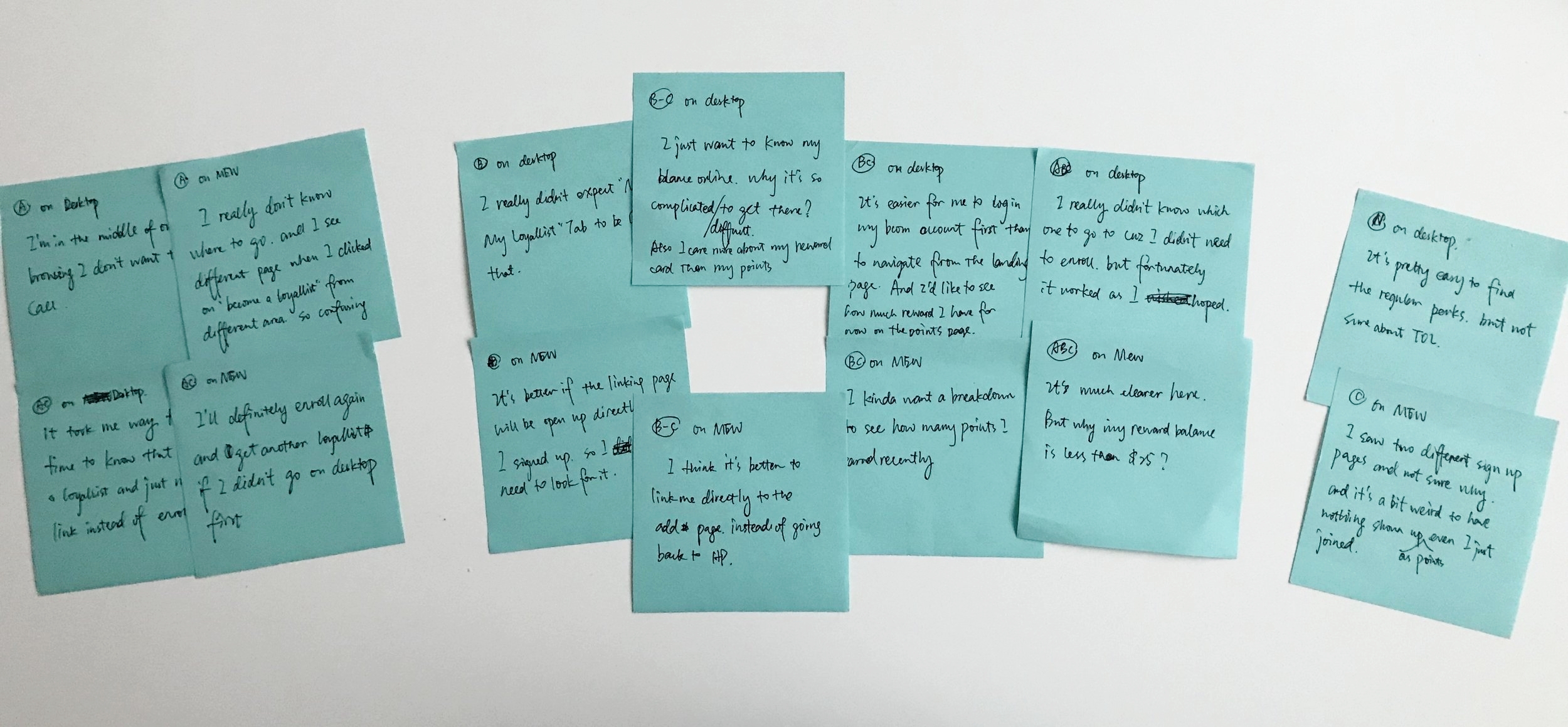
Notes from Observation Session
Meanwhile, I mapped out all the loyalty pages different users could come across as the user flow to mark down the findings. To simplify the process, I split the chart to 2 different stages as “before sign in” and “after sign in”, which takes "having a bloomingdales.com account" as the differentiator. It really helped me understand their pain-points and also gave me a better idea of how the pages are connected. Apart from what I took from the observation, I found there are some flaws in the page logic and also some practices I considered as misleading or not very intuitive (marked in red below) , especially before users signing in. The mobile site has a different page logic than desktop version, which seems better for a lot of users, but it hosts different pages for same functionalities.
DESKTOP BEFORE SIGNED IN
DESKTOP AFTER SIGNED IN
MOBILE BEFORE SIGNED IN
MOBILE AFTER SIGNED IN
Synthesis & Pivoting
Reframing the Key Problem

After gathering the concerns and painpoints from all different users, I tried to connect the dots everywhere to see if there are some common patterns in their very different journeys (with different tasks). Surprisingly, instead of understanding the information on the my points/account/perks page, it turned out that the step to log in, sign up or manage on the loyalty landing page is the most frustrating point of most user journeys. And the part of before signing in on desktop pages has the most problematic flow. A lot of the issues are about not sure where to go next because of the missing or ambiguous instructions.

THE INSIGHT
The Unexpected Difficulty and Confusion in the Logging In Process is Blocking Users’ Access to a Further Understanding of their Loyalty Information.
This key finding makes me rethink about the project scope and I had to inform other stakeholders about the most crucial problem of the loyalty program online. With the help of my manager, I got to meet with the business owner, the product manager, as well as the operation lead from dev side. I walked them through different user journeys, and shared my findings and thoughts with them. I also pointed out the limitation of current directions which focused more on My Points and My Perks page.
After a few meetings, I finally persuaded them into the new proposal which takes fixing the user flow as a major goal - especially the logging process. We aimed to provide all different users a smooth experience to view the loyalty related information. However, due to limited resources and time, we could only make improvements based on current flows, which means desktop and mobile websites will keep using different logics. We would be focusing more on the desktop contents since it required more enhancement.
Ideation
How Might We Make the Information Presented on All Loyalty Pages More Instructive and Useful?

Feature #1 The solution should have a clear flow to direct different users to their target pages easily.
The updated site map for desktop (below) could link user directly to the page they need to go without having them navigate around the site to get what they want, thus removing the hassle of them going into the wrong page and even calling to get the loyallist number which shouldn’t have been a blocker when browsing online. The new page also informs user clearly about the conditions of being a loyallist so they can easily find where to go next.

The updated mobile version (below) is majorly focusing on reducing the confusion by cutting out those duplicated pages and make them unified. It also connect certain pages to make sure they are linked correctly so users won’t have to do extra work.

Feature #2 The solution should speak to the different situations of all users effectively to help them move forward.
The new desktop landing page (below)still takes Bcom account as a differentiator but is trying to provide not more but more precise instructions to users so they could easily follow and take actions. Every single user is taken care of in this new structure. Even if they enter some page mistakenly, they could easily navigate to the right area by the hint and link on the page, such as looking up loyalist number page.
The mobile landing page (below)is more like a loyalist enrollment page, so the copy is slightly different to serve that purpose. Links to perks and TOL page are added since non-loyalist should have access to all related information to make the decision.
Feature #3 The solution should provide a personalized information hub for users so they don’t need to look for information everywhere.
The renovated My Points page will save users a lot of effort since it displays all key information they would need for the loyallist account. They can see their balance and when to expect new reward vividly. They will have a section for pending points so everything is transparent. Everything displayed is customized for the specific user. (The mobile pages were not touched because of the scope.)
Final Product
Satisfying Both External and Internal Customers
After I came up with the key features for new loyalty program online, we went for another round of meetings review with the stakeholders - our internal customers. Fortunately, they were on board with the directions and gave me a few suggestions from branding/business standpoint of views. The end product was the result of balancing opinions and needs from different stakeholders.
Some typical scenarios starting from the loyalty landing page are displayed below. The "CREARE ACCOUNT" scenario won't be shown because the design of that page was not changed.
LOYALTY LANDING PAGE


TOP OF THE LIST PERKS PAGE

Takeaways
Learning to Dance in Fetters
1. No matter what kind of projects we are doing, we should always take the user-centered approach and identify the real problems.
2. Try to lead the conversation when it comes to my expertise, while keeping the business stakeholders’ benefits in mind any time. People are convincible with strong evidence and plausible suggestions.
3. There are always constraints in different projects, but try to work around it without compromising on the key problem. Learn to make the best use of all kinds of limited resources and propose a reasonable solution based on that.